In 2001, after twenty years of working as an illustrator in Detroit, I got a job teaching two-dimensional art at a new charter high school for students with an interest in the fine and performing arts: Arts Academy in the Woods, located in suburban Detroit. Part of the deal was that I had to get my teaching certification, so I enrolled in the art education program at Wayne State University.
One of the classes I took was a printmaking "methods" class. The purpose of methods classes is to teach different techniques within a given medium, and how to structure appropriate lesson plans for your students. The printmaking methods class was taught by Dr. Lorraine Ross, who was also chair of the art ed department at that time. Dr. Ross is an excellent and inspiring teacher, and I thoroughly enjoyed the class. I had done some linocuts back when I was very young, but had not done any printmaking since then, so this was a very nice change of pace for me.
We did a number of different types of prints, but I had the best results with relief printing. We also did some intaglio prints, but I was not 100% happy with how they came out so you will not be seeing them here!
(You can click on the images below to zoom in.)
This first print is a "glue print"-- you draw on a piece of cardboard, using white glue. Once it is fully dried, you roll ink on it and print it. This is a great project for younger students, but I have also used it as an "activity" for a 2D Art unit in a humanities class that I teach. Actually, I think that this is just a pretty cool way to make a print! (My good friend Joe M. was the model for this piece.)

Little Joe, 8" x 10"
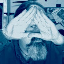
This next piece is a "reduction" print. In a reduction print, you print multiple colors using the same template from which more material is cut away (reduced) for each successive color, revealing the colors underneath. (A template is the surface you are printing from, such as a piece of wood, linoleum, metal, or in this case, a piece of Styrofoam cut from a tray that some meat was packaged in.)

Untitled self-portrait, 6" x 8"
This print was made from a material called E-Z Cut (a.k.a. Soft-Kut, etc.) This is a good material for students to use for their first block print-- a lot easier to cut than linoleum. This piece was based on a short story I read a number of years ago in a horror anthology about a succubus that took over a small town. Unfortunately, I can't remember the author or the name of the story.

Succubus, 4" x 4.5"
This linocut was selected for the postcard that was sent out for the Art Education Spring Show at Wayne State University (2002).

The Dream, 8" x 10", linocut
The last print I would like to show you is a collagraph. Collagraph comes from the French la colle, which means glue. In a collagraph print, materials are glued to the surface of the template-- cardboard, string, whatever-- and then it is inked and printed. For this piece I am also showing a photo of the template (prior to inking it), as well as the reference photo that I used.

486, 8" x 10"


Finally, here are a couple of sketches that I made (some time after the class was over), intending to make linocuts from them. To date, these pieces have not been cut or printed, but hopefully one of these days, I will get around to it. These are portraits of my parents; they were drawn with digital pastel using Painter (similar to Photoshop) and a Wacom tablet.

Roger, 8" x 10"

Mary Jane, 8" x 10"
3 comments:
Rick,
Thank you so much for sharing your gorgeous artwork with me. The pieces in this post... wow! They're so dramatic and so captivating! I'm hooked! You've officially become Creative Melting Pot's first featured artist. I added your site to my Links To Visit and hope to allow more people to enjoy your work! Thanks so much again, for sharing!
Best wishes!
Kacie
RJ,
Thanks! Beautiful artwork! As a non-2D artist, I also appreciate the detailed explanations. Please keep sharing your original work here. It looks like you're attracting a well-deserved following.
- Les
Dear R.J.:
Smart, beautiful, shrewd, and sometimes, sublime. That's how I would describe your site. Really cool. The drawings, reminiscent of a film noir dream, are unavoidably compelling to anyone who likes the gothic, the surreal, and the neo-abstract realism that flows through your aesthetic.Which is to be expected by anyone that knows you. I'm sorry it took me a minute to comment. I wanted to say a word about the pre-raphaelites. Suffice to say that your favorites are mine also. I would only add that I love the granddaddy (link with the past) proto-pre-raphaelite, William Blake alot (Sir Blakealot) and Burne-Jones (although he has a sort of what I'll call a stylized realism to his work. I have also been listening to the ambient CD you sent me, and like it mucho. Dogs barking in the rain cheer up weirdos like me. We'll get to the recording, I haven't forgotten, I've just been focusing on other areas at the moment.
Love - Randy
Post a Comment